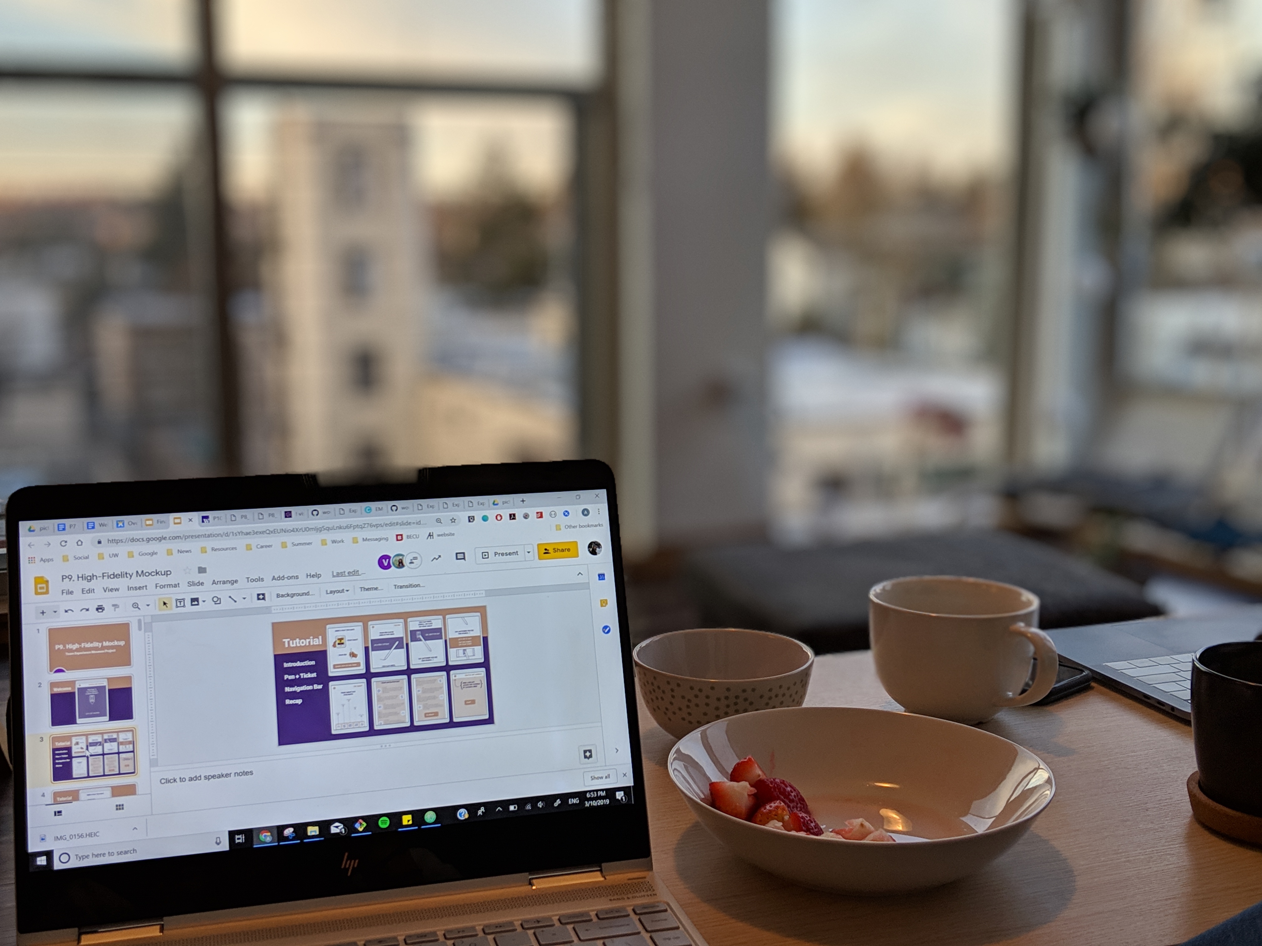
Design

Wireframes

With a solid foundation from our paper prototype evaluations, we created a set of wireframes to outline our screens. When creating our wireframes, we outlined our entire system of screens. We used our information architecture to delineate the system’s flow. Throughout our wireframes, we outlined where text blocks, images, and icons could be placed throughout. As a group, we split up separate pages and created different styles of wireframes, then converged ideas for our high fidelity screens.
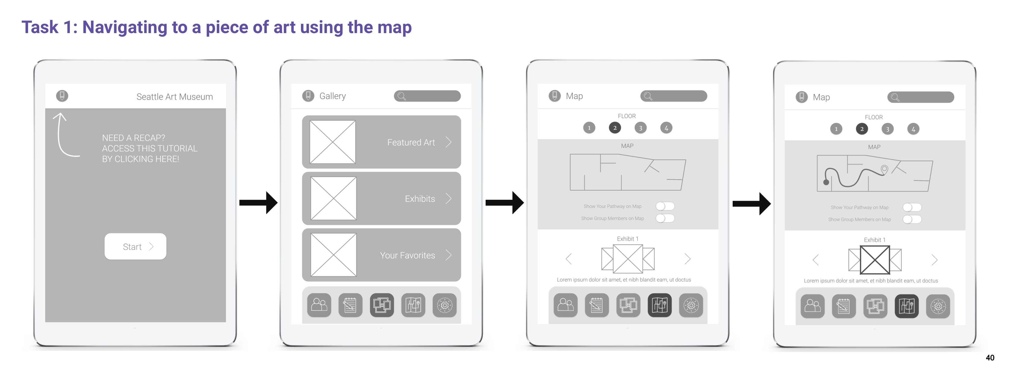
Diagram of task 1. Diagram of task 2. Diagram of task 3.

Takeaways

From our annotated wireframes, we learned:

  • How to use our preliminary designs to lay out the content and images for each part of our system
  • To use the critiques we received from our peers to see which parts of our interactions were confusing or hard for users to navigate through
todo
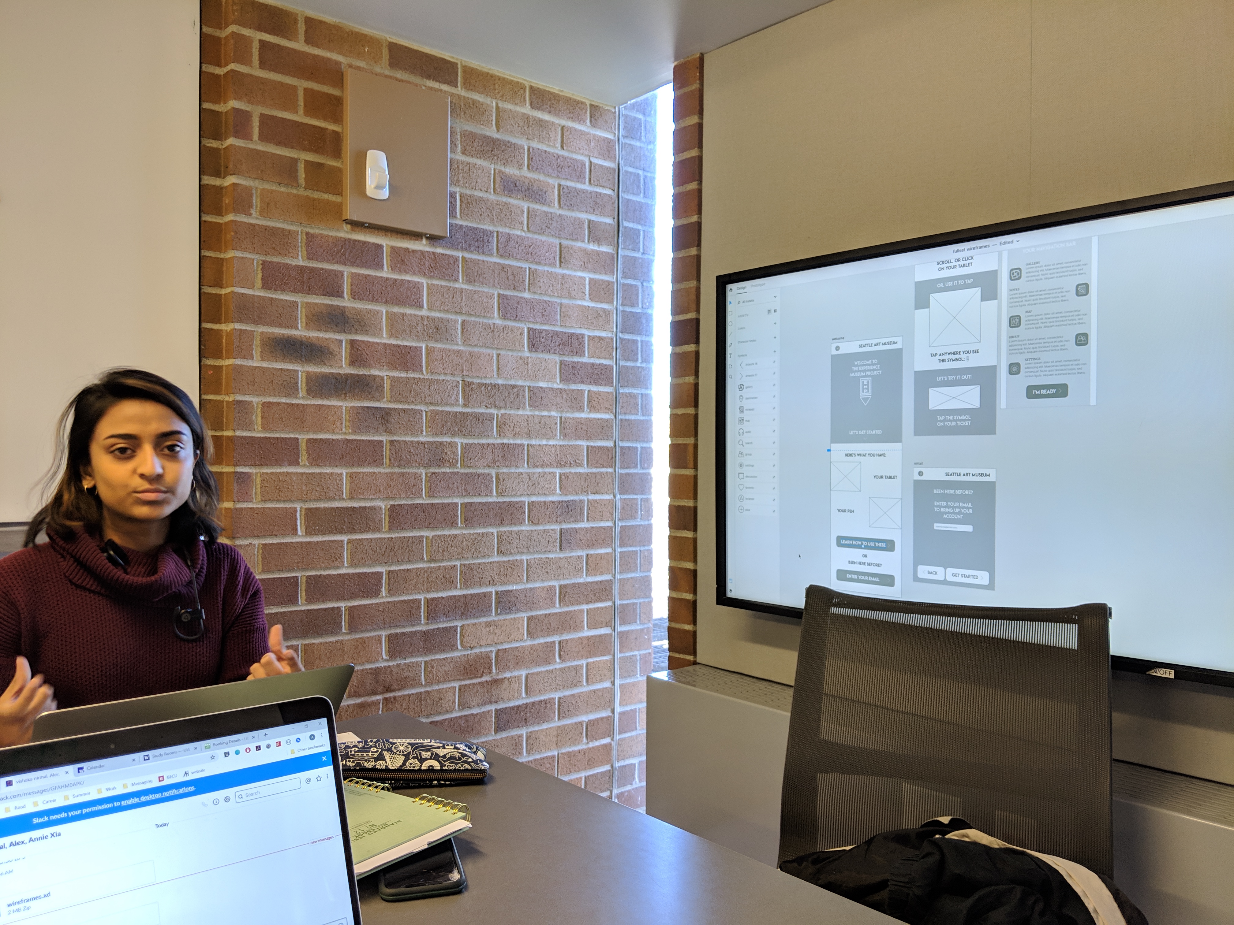
Vishaka discussing the wireframes with the team.
todo
Alex writing out a to-do list on a whiteboard.
todo
Annie and Vishaka hard at work.

High-Fidelity

For our high fidelity screens, we took the information we gained from our design critiques and refined our interfaces. By adding a color theme, real pictures from the Seattle Art Museum, and informational text, we worked to create a mockup of the real screens that would be seen in our product if a user were to use it throughout an art museum.


Takeaways

From our high-fidelity mockups, we learned how to:

  • Develop our designs using color themes and real content from the Seattle Art Museum website
  • Use peer critique on our screens to adjust our visual designs accordingly

Interact with parts of our prototypes below!

Tutorial

Main Pages

Trip Review